Enterprise SaaS · Compliance dashboards · BigFix WebUI
Shruti Upadhyay · Sole UX Designer · HCL Software
300,000
endpoints at scale
<3s / <20s
Landing / Detail page SLA
6
key structural decisions
Stage 1 of 6
roadmap foundation
Security teams were flying blind
BigFix had a compliance tool, Web Reports, but it wasn’t built for how modern compliance teams work. No single place to see posture. No filtering. No path from identifying a failing check to fixing it without switching systems entirely.
What didn’t exist
Real consequence
What Security Configuration solves
No live compliance overview
Admins opened each device, device group, and check individually
Real-time landing page with KPI cards
No filtering capability
Cross-referencing separate reports for specific regions or groups
Global filter, 4 dimensions, multi-block OR logic
No saved or default views
Every session started from scratch
Saved views with default auto-load
No path from failure to action
Had to switch to a separate system to act
Deploy directly from Security Checks grid
No per-checklist compliance detail
Surface-level data only, no drill-down
Single Checklist View: 5 charts + Security Checks grid
Three personas. Every layout decision validated against all three.
Used as a validation lens throughout — for every decision: which persona does this serve, at what moment, and does it work for all three without one compromising another?
Security / Compliance Admin
Primary user · Defines and enforces policies
Needs environment-wide posture at a glance. Applies saved filter scopes. Drills into checklists. Reviews charts across 5 dimensions. Initiates check enforcement when needed.
Drives: Landing page + global filter, all 5 compliance charts, saved views + default view auto-load
IT Operations Admin
Manages device health · Executes enforcement
Gets to the Security Checks grid fast. Filters to non-compliant checks. Selects rows. Deploys. Less interested in charts, focused on action, not analysis.
Drives: Security Checks grid, grid filter by status, row selection + Deploy button
Master Operator
Full platform admin · Sets org-wide defaults
Monitors environment-wide counts from KPI cards. Creates saved views for different teams. Sets the default view so the whole organization lands in the right scope on arrival.
Drives: 4 KPI cards, saved views management, default view auto-load configuration
Two of the most structural layout decisions came directly from persona analysis. The landing page leads with KPI cards before the checklist grid, because the Master Operator needs environment-wide counts before making any selection. The Security Checks grid has its own independent filter, because the IT Ops Admin works at grid level, not page level.
Primary compliance workflow, end to end
Security / Compliance Admin path
IT Operations Admin path
Land on Security Configuration
↓
Apply filter or load saved view
↓
Read KPI cards
Checks, Devices, Device Groups, live
Click checklist row
SC Admin
↓
Read 5 compliance charts
SC Admin
Filter grid: Non-Compliant
IT Ops Admin
↓
Select checks + Deploy
IT Ops, SC Admin
Check enforced — posture updates live
What Stage 1 is, and what it deliberately isn’t
All Stage 1 requirements are P0, must-have at GA. Scope discipline here mattered as much as the design itself.
Must Have
Live compliance landing page with real-time KPI cards
Single Checklist View with 5 charts + grid
Global filter across 4 dimensions with multi-block OR logic
Saved views with default auto-load
Deploy directly from Security Checks grid
CSV/PDF export scoped to active filter
WCAG 2.1 AA throughout
Should Have
Profile/category filtering (CIS L1/L2, DISA Cat I/II/III)
Scheduled reports
Shared saved views between users
Could Have
Checklist Management (Stage 2)
Historical Analysis (Stage 4)
Exception Management (Stage 5)
Universal Checklist (Stage 3)
Won’t Have
Multi-checklist selection in one view
CMEP (Stage 6)
Global environment-wide pages beyond Core BFUI
Three iterations. Each shaped by a real constraint.
The PRD went through four versions across three weeks. Design decisions fed back into product requirements, and product discussions fed back into the wireframes.
v1.0
18 May
Initial draft, three-section layout
v2.0
25 May
Live dashboard as default page
v3.0
1 Jun
Scope tiered P0/P1/P2
v4.0
8 Jun
Major restructure — P1/P2 removed, 5 charts from 7, “Deploy” replaces “Remediate”, two-page split finalized
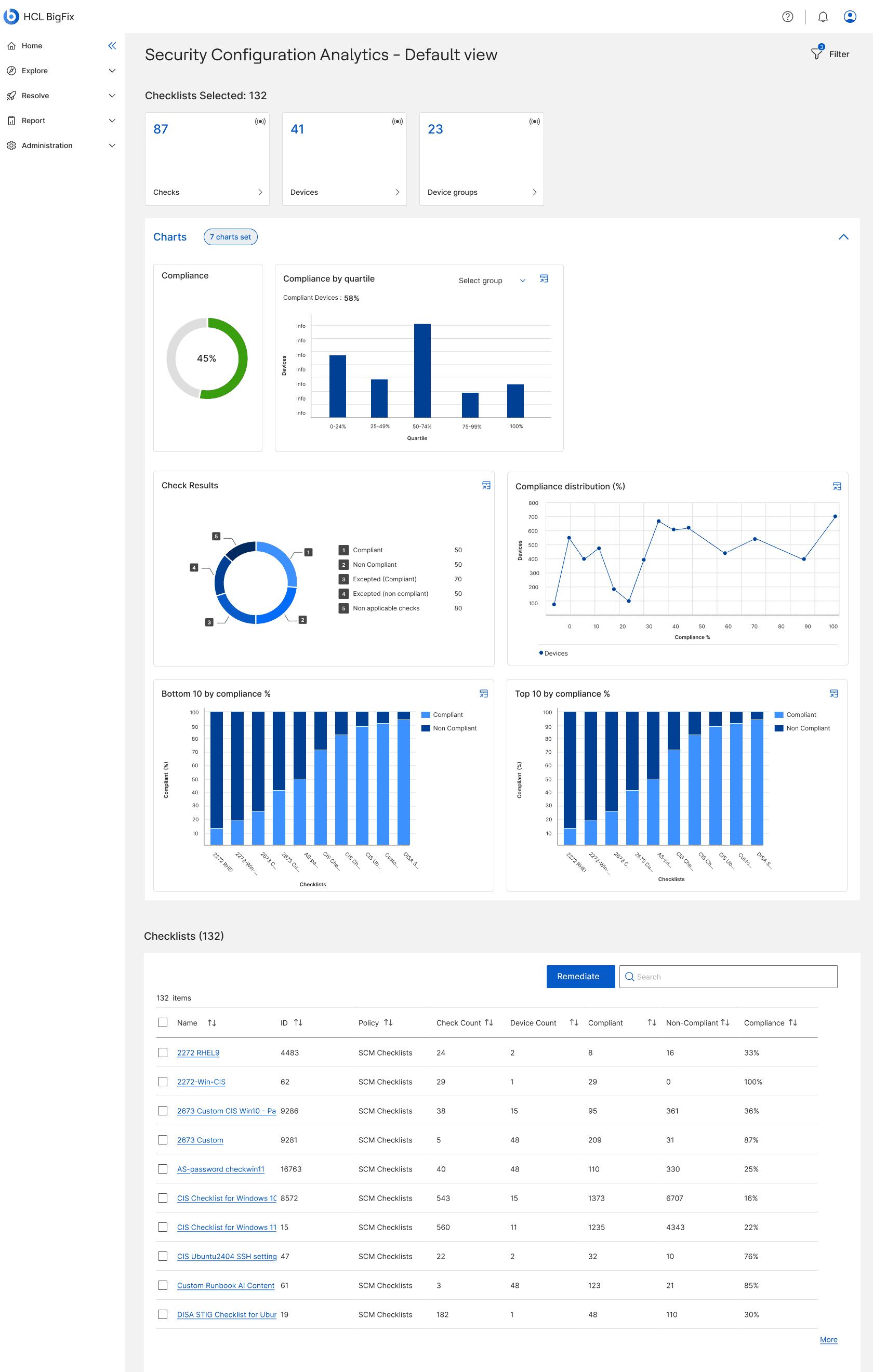
Iteration 1 — Single page, all checklists, 7 charts
Dropped
What broke: Unacceptable load performance at 300,000-endpoint scale. Two filter layers on one page created ambiguity. 7 charts, 2 of which were meaningless once scoped to one checklist. ‘Remediate’ misrepresented the actual proactive workflow.

Iteration 2 — Single-checklist model, dropdown selector, empty state
Partially adopted
What held: Solved the load problem — nothing renders until a checklist is selected. Established the single-checklist principle. What broke: Dead-start experience, blank page with zero context. 132 checklists in a dropdown doesn’t scale.
Iteration 3 — Two-page split: lightweight overview + scoped detail
Approved
What worked: Performance solved by separation — Landing Page loads under 3s, Single Checklist View under 20s independently. Context before choice. One filter per page, zero ambiguity. Checklist grid as navigation, not data. ‘Deploy’ replaces ‘Remediate.’
Six calls that defined the product
1
One filter per page
UX Principle · Filter Architecture
Adopted org-wide
Two filter layers on one page created ambiguity about which one controlled what. Introduced the principle: one filter per page. Restructured both pages and resolved confusion before it could surface in testing.
2
Two-page split
Performance-Driven Architecture
Approved as proposed
7 charts, a 132-row table, and KPI cards loading simultaneously made the page genuinely slow at scale. Split into two pages, each with its own achievable SLA. Performance SLAs are design constraints, not engineering targets.
3
The Checklists KPI card
Stakeholder Negotiation
Compromised
Pushed to remove it as redundant with the grid header count below it. PM wanted it retained for consistency. Differentiated it visually instead — no chevron, black instead of blue — so it reads as informational, not interactive, without a disabled state or explanation needed.
4
Saved Views placement
Information Architecture
Approved as proposed
A saved view is a saved filter configuration — placed it inside the filter panel, not as a separate header element, making that relationship explicit and keeping the header clean.
5
“Deploy” replaces “Remediate”
Terminology
Approved as proposed
“Remediate” implies reacting after damage. The actual action is deploying a Fixlet to proactively enforce a check. Agreed in cross-functional review — a small word change with a large positioning implication.
6
“Security Configuration” under Resolve
Naming & Navigation
Stakeholder aligned
Dropped “Analytics” from the working name since it implied passive reporting. Placed under Resolve to position it as an action-oriented tool. Aligned with both PMs before it unblocked repo creation, UI strings, and breadcrumbs.
5 charts. 2 removed. Every remaining one earns its place.
The earlier design had 7 charts, including two that compared checklists against each other — meaningless once scoped to a single checklist. Cut.
Chart
Question it answers
For whom
Compliance donut
What is the overall compliance % for this checklist right now?
SC Admin, MO
Compliance by Quartile
How are devices distributed across compliance bands? Where should enforcement focus first?
SC Admin, IT Ops
Devices below Threshold
How many devices fall below my defined threshold, broken by OS?
SC Admin, IT Ops
Check Results
Are exceptions masking real failures?
SC Admin, MO
Compliance Distribution
Do devices cluster near 100% or spread across the range?
SC Admin
Charts 2 through 5 each have a table-view icon for WCAG 2.1 AA screen reader access. Chart 1 doesn’t — a compliance donut showing 45% is already a single accessible number; a table view would add no value.
The approved wireframes
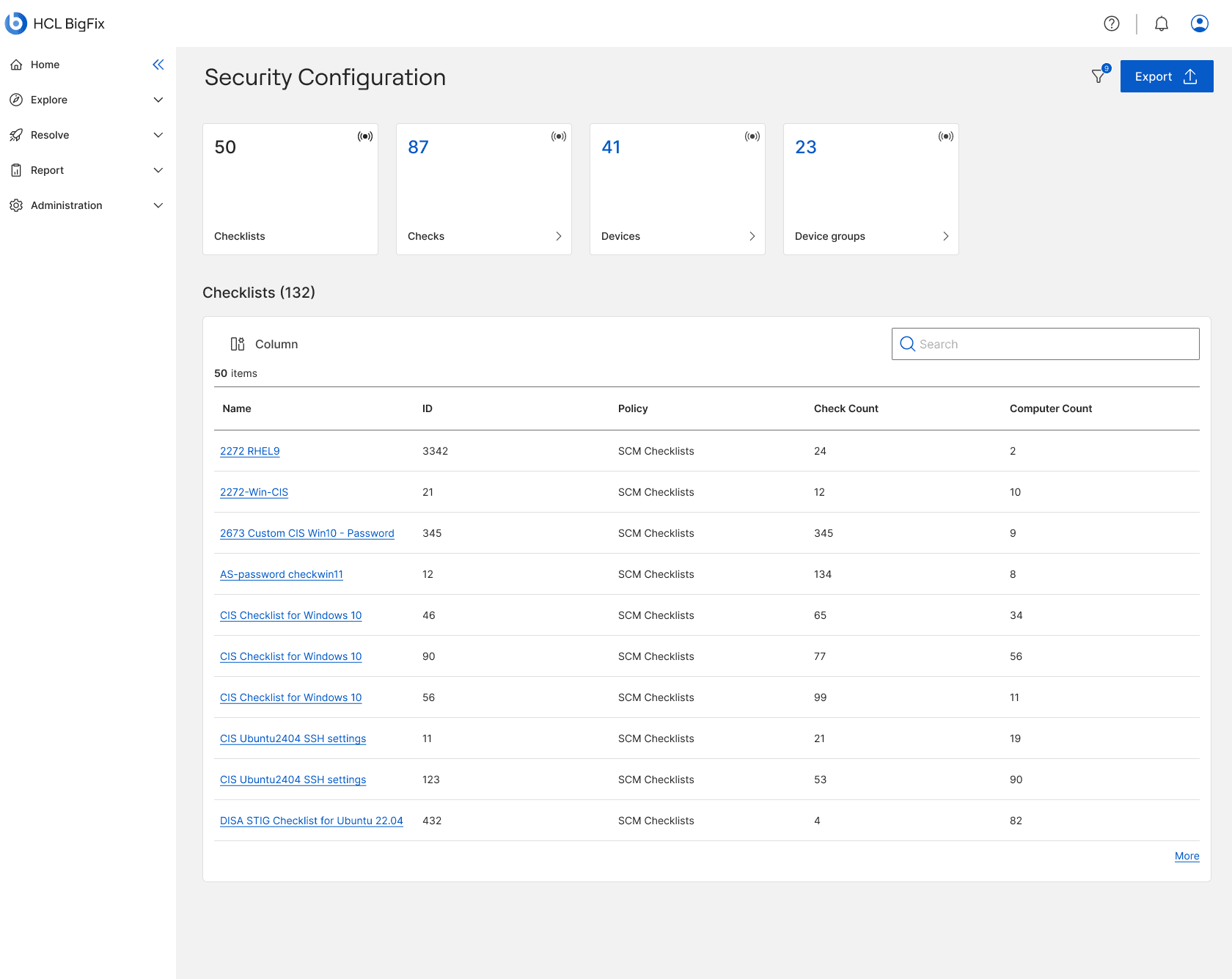
Landing Page (default state)
The landing page is a navigation and orientation surface, not an analysis surface. KPI cards give context in under 3 seconds. The checklist grid is deliberately stripped of compliance columns.
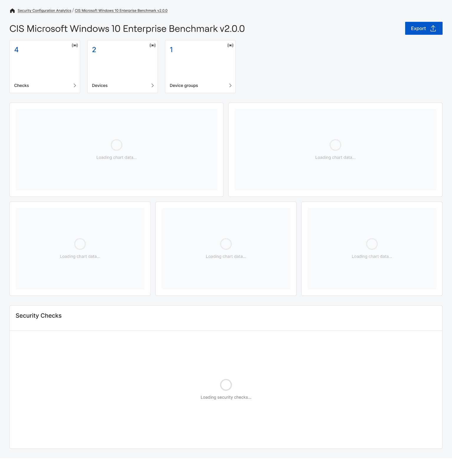
Single Checklist View (loading state)
KPI cards render within the 3-second SLA. Each section fails and recovers independently — a chart error never blocks the Security Checks grrid.

Single Checklist View (fully loaded)
The Security Admin reads posture across 5 chart dimensions before deciding to act. The IT Ops Admin scrolls directly to the grid. Both workflows coexist without compromising either.
My contribution
I owned & shaped
All wireframes across both pages, every state
One-filter-per-page principle
Two-page split recommendation
Cut 2 irrelevant charts
Checklists KPI card compromise
“Deploy” over “Remediate”
Confirmed product name and navigation placement
Confirmed accessibility mechanism (closed PRD Q7)
Saved Views placement
Constraints I worked within
Scale: 300,000 endpoints, 1,000 checks per checklist
Stage 1 scope only, Stages 2-6 out of scope
WCAG 2.1 AA and FIPS 140-2 non-negotiable
Hard performance SLAs
Core BFUI destination pages built by another team
HCL Design System only, no custom components
Outcomes
1st
Live real-time compliance dashboard in BigFix’s history
3
Design iterations shaped through cross-functional participation
12+
Screen states delivered, every PRD scenario accounted for
6
Product structure decisions, not just visual decisions
Wireframes approved by both PMs, the project director, senior architects, and engineering. UI build in progress. Stage 1 is the foundation for 5 downstream stages.
Reflections
Went well
Establishing the one-filter-per-page principle early gave a consistent framework to defend structural decisions. Principles are easier to align teams around than preferences.
Went well
Treating performance SLAs as design constraints, not engineering problems, kept load time central to every layout decision.
Went well
Using the three personas as a validation lens, not just a reference, gave every decision a user-grounded reason and a way to negotiate compromises.
Would do differently
Would push for at least one session with a real security/compliance admin before wireframing. The personas were well-defined in the PRD but not user-validated.
What’s next
Stage 2, Checklist Management, introduces creating, editing, cloning, and deploying flows. Stage 1’s grid patterns and filter architecture were deliberately designed to scale into it.