
How this was approached
01 Research
Primary + secondary, AI-assisted
02 Personas
AI drafted, human filtered
03 Competitive analysis
Framework by AI, findings by hand
04 UX writing
Variants generated, one corrected
05 UI generation
Figma Make draft, 23 defects audited
06 Audit and ship
Heuristic evaluation, not user testing
The impact, at a glance
73%
Investors surveyed who close the app on a loss
23
Defects found and fixed in AI output
6
Design stages, AI involved in every one
Research — real data, not assumptions
20
people surveyed, matching the exact target persona
15 of 20
currently invest or have invested
Before touching any AI tool, I ran a 20-person survey with people matching the exact target profile — salaried professionals, 25–35, metro India. Every design decision in this case study traces back to something a real person said or did.
The core finding: 73% of investors (11 of 15) closed the app immediately when they saw a portfolio drop. Not because markets failed them. Because the product failed them. The app had 3–5 seconds to prevent the user from leaving — and it said nothing.
What users wished the app had said
Mentions
“Is this normal?”
6
“Why did it go down?”
5
“Should I do anything?”
4
“Will it recover?”
2
“Should I continue my SIP?”
1
The critical insight: the most-asked question was never “How much did I lose?” Users already had that number. What they lacked was the context to interpret it.
Two people, one governing principle
ARJUN — The Informed Procrastinator
Age 31, Marketing Manager, Mumbai
“I know I should invest, but every time I open the app there are too many choices, and I close it.”
Goal
Make his money work harder than a savings account without becoming a full-time researcher
Design implication
Show why for every recommendation. One clear “best for you” option with visible reasoning.
SNEHA — The Goal-Driven Beginner
Age 28, School Teacher, Pune
“My friend showed me her SIP returns, and I thought — I could be doing this. But the apps feel like they’re not for me.”
Goal
Save ₹8–10 lakh for a house down payment in 5 years. Safety over growth.
Design implication
Reduce decisions to the minimum. Never show a number without context.
A third AI-generated persona (“Priya, power user of 8+ financial apps”) was cut — she was already engaged and didn’t represent the anxiety-and-avoidance problem this project addresses.
What competitors get wrong
Dimension
Groww
Zerodha
ET Money
Paytm Money
FinSight opportunity
Recommendation transparency
None — no “why” shown
None
Partial (goal-based)
None
Visible reasoning for every recommendation
Post-investment experience
Number goes up/down
Number goes up/down
Basic summary
Number goes up/down
Contextual commentary during drops
Trust signals
SEBI badge
SEBI + brand heritage
SEBI + reviews
Brand (Paytm)
Explainability as trust
The gap: no existing app combines personalized recommendations with visible reasoning and contextual support during portfolio drops. The design opportunity is making the why a feature.
What made it into scope, and why
Must Have
Contextual reassurance when portfolio drops
“Why did this happen?” in plain language
Decision guidance, ranked options
Contextual education at the anxiety moment
Reconnect user with original investment rationale
Qualitative goal indicators only (“On track,” not “92% probability”)
Should Have
AI chat for questions
SIP adjustment with consequence preview
Notification intelligence
Could Have
Tax summary (80C, LTCG)
Portfolio stress test — “what would 2008 look like for your portfolio?”
Behaviour awareness card (checking frequency vs. healthy average)
Won’t Have
Stock trading, crypto
Social/community features
Market timing signals
Where I overrode the AI: it suggested social proof features — “show what similar users are investing in.” I removed this. In fintech, that creates herd behavior, the opposite of informed decision-making.
AI prompts, outputs, and verdicts
01
Secondary research
Claude
The ask
Find the top emotional pain points and trust-loss moments across 40 competitor app reviews.
AI delivered: a ranked list of pain points and trust-loss patterns across Groww, Zerodha, ET Money.
Verified
Read every underlying review myself before accepting any pattern; a confident-sounding pattern from thin evidence is the exact failure mode AI synthesis invites.
02
UX writing
Claude
The ask
Write five ways to explain a portfolio drop, under 60 words each.
AI delivered: five variants, including a ‘100% of the time’ recovery claim.
Rewrote
Rejected the false-certainty claim, a real SEBI compliance risk, and replaced it with an honest, checkable range: ‘most recovered within 3 to 8 months.’
03
UI generation
Figma Make
The ask
Full spec for three screens: dashboard, explanation, insights.
AI delivered: a complete, ready-looking UI in one pass.
23 defects found
Looked complete to a non-designer. Structured audit found loss shown before reassurance, an unverifiable stat, a compliance risk, and color-only loss indicators failing WCAG. All fixed before ship.
23 defects across 4 categories
UX — 7 defects
e.g. loss shown before reassurance, unverifiable comparison stat
UI — 5 defects
e.g. inconsistent card styles, angular sparkline creating visual anxiety
Accessibility — 6 defects
e.g. contrast failures below WCAG 4.5:1, color-only loss communication
Trust & Compliance — 5 defects
e.g. recommendation basis not disclosed, recovery stats presented as certainty without SEBI disclaimer
What shipped

Dashboard
Reassurance before the loss number, always
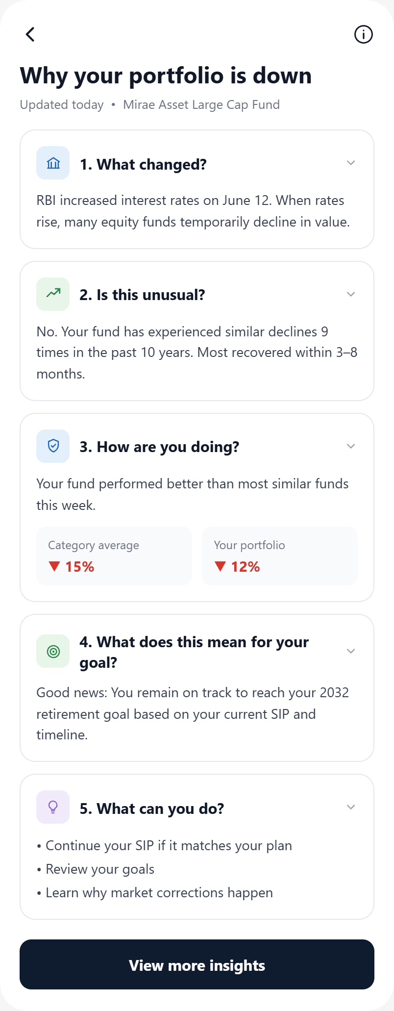
Explanation
Answers questions in the order research found people ask them

Insights
Behavior-awareness card addresses the root anxiety, not the symptom
The honest summary
AI made me faster at every stage. It made me better at none of them without my judgment.
Stage
AI contribution
Human judgment added
Research synthesis
Pattern identification across 40 data points
Validation against raw data, removal of over-interpreted signals
Persona generation
Structural first drafts
Behavioural specificity, dropping the weak persona, adding entry triggers
UI generation
Base layouts in 30 minutes
23 defects identified and corrected across 4 categories
Microcopy
5 variants per scenario
Selection rationale, trust-context additions, liability-aware editing
My contribution
What I owned
Primary research (20-person poll)
Secondary research validation
Persona work — draft evaluation, refinement
Competitive analysis — personal review of 5 apps
All scope decisions (MoSCoW)
Figma Make prompt engineering
Defect analysis — 23 issues documented
Final wireframes, complete redesign
Microcopy final selection
Constraints I worked within
No direct user testing beyond the initial poll
Concept product, no engineering feasibility validation
SEBI regulatory context requires care in language implying performance guarantees
Designed only the post-investment anxiety experience, all other flows treated as existing
Reflection
What worked well
Using AI for quantity so I could focus on quality. The systematic defect analysis forced me to articulate exactly why each AI output was wrong. The real research anchored everything — “73% closed the app immediately” makes the entire case study defensible.
What I’d do differently
Run moderated usability testing on the explanation screen specifically with Tier 2 city users — my survey skewed metro and tech-comfortable. I’d also push for one session with a real first-time investor before wireframing.
The meta-learning
AI in design is not a skill, it’s a judgment. Anyone can paste a prompt and use the output. The skill is knowing when the output is wrong and what to replace it with. The best thing AI did in this project was give me something to disagree with.