Enterprise SaaS · Installation flow redesign · Shipped
Shruti Upadhyay · Sole UX Designer · HCL Software · 2024 · Shipped
8
screens, every state, light and dark
13
developer handoff spec areas per screen
2
new steps designed from scratch
accessibility, no spec to full WCAG 2.1 AA
BigFix is HCL Software’s enterprise unified endpoint management platform, used by large organizations to discover, secure, and manage thousands of devices from a single console. The Configuration Manager installation flow is the first thing an administrator runs before the product can be used.
“BigFix operators need a consistent flow throughout BigFix to deploy content to agents, because the BigFix learning curve is high.” — HCL BigFix product team problem statement
When I joined, a functional prototype existed. It was not production-ready.
Did not meet HCL Design System standards
Failed WCAG 2.1 AA accessibility requirements
Missing two configuration steps required by the SaaS environment
The BigFix team had persona research mapping every role from CIO to Deployment Specialist. I checked this project’s actual scope against every persona on that map — only one holds up: Scott.
SCOTT — BigFix Admin
What he does: Installs BigFix platform components · Manages relay and client infrastructure · Provisions operators and provides ongoing support · Monitors and remediates performance issues · Defines strategy for BigFix use · Supports BigFix integrations
“I want to know quickly if my environment is healthy and take actions if required. How can I be more effective?”
Decision factors: Easy to maintain infrastructure · Reliable delegation access to users · Visibility in the environment · Cost-effective infrastructure
Design implication: Scott runs this flow infrequently and needs to know where he is, what’s done, and what’s next, without asking. The stepper on every screen delivers this directly.
HCL operates on a design thinking methodology, Empathize → Define → Ideate → Prototype → Test, run in Agile sprints with continuous validation.
1
Evaluate
Heuristic evaluation of the existing prototype against WCAG 2.1 AA and the HCL Design System. Findings documented and prioritized with senior UX leads and PM.
2
Define
Translated audit findings into specific design problems rooted in user needs. Mapped the complete flow including the two new SaaS steps.
3
Design
High-fidelity screens in Figma, all states, all breakpoints, dark mode. Every component mapped to the HCL Design System.
4
Review
Structured stakeholder reviews with senior UX, UI engineering, and PM. Two revision cycles before approval.
5
Specify
Full accessibility and handoff specification, 13 areas per screen. Living iteration log maintained through development.
6
Validate
QA against implemented screens to verify fidelity before shipping.
I evaluated the existing prototype across every screen. Here’s what I found, and the design decision each finding drove.
01
No progress visibility
BEFORE
Flat tab navigation gave no indication of sequence, completion, or what remained. An admin running this flow infrequently had no way to orient themselves mid-configuration.
AFTER
A persistent stepper is added to every screen, showing position, completed steps, and what’s next, the foundation of the ‘Always oriented’ principle.

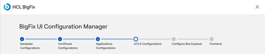
Insight: Scott runs this flow infrequently, persistent orientation isn’t a nice-to-have; it’s the difference between confidence and getting lost mid-configuration.
02
Validation felt like failure
BEFORE
Guidance was inconsistent across fields, not absent. Admin Credentials had live pass/fail feedback next to the password field, but SQL Server and Database Name had no example at all, and CORS Allowed Origins buried its only guidance in a dense paragraph below the field.
AFTER
Every field gets the same treatment: a requirement and format example placed directly above or beside the input before interaction, not just for the one field that already had it.


Insight: One well-designed field next to three under-supported ones isn’t a system, it’s an accident. Guidance before validation had to be applied consistently, not just where it happened to already exist.
03
Accessibility failures throughout
Critical
BEFORE
Required fields marked with asterisk only. No password visibility toggle. The checkbox blended into the background. No heading hierarchy, no keyboard navigation order, no skip links, no alt text specified.
AFTER
Full WCAG 2.1 AA specification applied, heading structure, numbered keyboard tab stops, skip links, alt text for every element, screen reader labels for every interactive state, and semantic page regions.

Insight: BigFix serves regulated industries, including government, accessibility compliance is non-negotiable, not a nice-to-have.
04
Dense, unreadable guidance
BEFORE
Configuration instructions were delivered as dense paragraphs of inline text, forcing the admin to parse technical requirements mid-form.
AFTER
Broken into scannable guidance: numbered instruction lists, inline tooltips, and format examples placed directly in the field (DSN format examples on Database Configurations, CORS field descriptions with example URLs on Application Configurations).


Insight: Every field in this flow blocks the rest of BigFix from working, unclear configuration guidance here has a higher cost than almost anywhere else in the product.
05
Inconsistent components — HCL Design System violations
BEFORE
Components across the flow didn’t map to the HCL Design System, inconsistent button styles, spacing, and form patterns would have created visual dissonance with the rest of BigFix.
AFTER
Every component is remapped precisely to the HCL Design System (‘System-consistent’ principle), reducing visual inconsistency and long-term engineering maintenance debt.


Insight: Every inconsistency here becomes engineering maintenance debt across the entire BigFix product, not just this one flow.
06
Missing steps
BEFORE
The SaaS environment required two configuration steps, mTLS Configuration and BES Explorer Configuration, that didn’t exist anywhere in the original prototype.
AFTER
Both were designed from scratch and integrated into the wizard without disrupting the existing information architecture.

Insight: Both mTLS and BES Explorer are SaaS-only requirements, skipping them wasn’t an option; only how well they were designed was.
Always oriented
Scott runs this flow infrequently. He needs to know where he is, what’s done, and what’s next, without asking. The stepper delivers this on every screen.
Guidance before validation
Show requirements before interaction, not as errors after. Shifts the experience from correction to preparation. Applied to every form field in the flow.
Accessible by default
Every colour token, contrast ratio, heading level, tab order, label, and alt text is evaluated against WCAG 2.1 AA first. Not a final pass, embedded from the first frame.
System-consistent
Every component maps to the HCL Design System precisely. Consistency enables trust across the broader BigFix product and reduces engineering maintenance debt.

1. Splash
Product identity established. Legal notes. Single CTA: ‘Launch BigFix UI Configuration Manager.’ No stepper yet, this is pre-wizard.

2. Administrative Credentials
The most critical screen. Sets the credential that secures the entire configuration. Requirements shown before the field. Password show/hide toggle. CTA disabled until all criteria met.

3. Database Configurations
Stepper introduced. DSN format guidance with two concrete examples. Replaces the ambiguous ‘Verify Credential’ button in the original prototype.

4. Certificate Configurations
Radio button choice for certificate type. PEM format text areas with scaffold placeholder text showing expected format directly in the field.
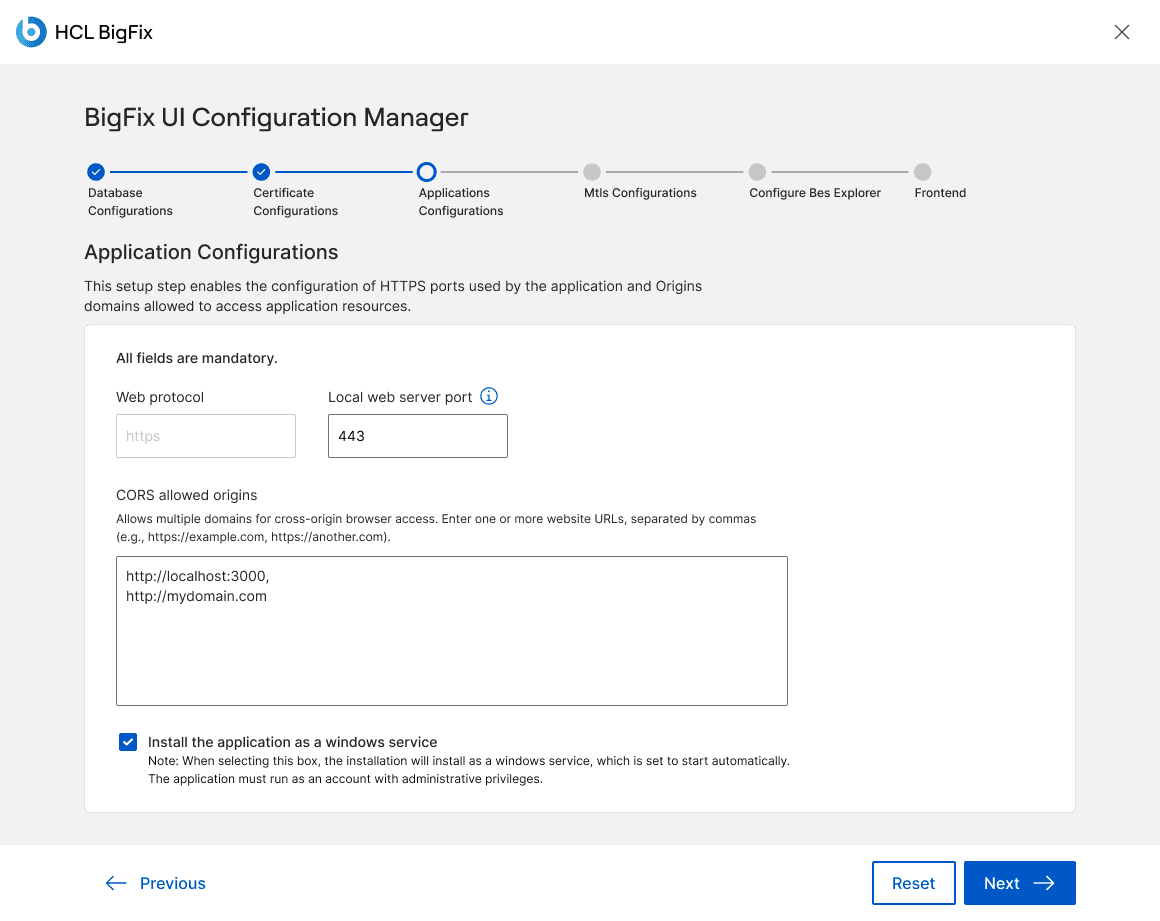
5. Application Configurations
Inline tooltip on port field. CORS field with label, description, and example URLs. HLDS checkbox with visible border and associated helper text.

6. mTLS Configurations
New
Four-step instruction list before the form. Algorithm and certificate authority selection via radio button pairs with clear defaults.
7. Configure BES Explorer
New
Four-step instruction list explaining the connection process. Two-column layout for IP + port, username + password. Tooltip on port with default value.

8. Frontend
Intentionally minimal. The stepper shows 5/6 complete. Single action: ‘Deploy frontend.’ No form fields, respects the user’s mental state after a long configuration sequence.
Area
Specification
Contrast
All combinations verified against WCAG 2.1 AA using HCL Design System tokens
Heading structure
H1: product title, H2: step section, annotated on every screen
Page regions
header and main semantic landmarks annotated for engineering
Keyboard navigation
Numbered tab stops on every screen, e.g. Admin Credentials has 9 stops
Skip links
“Skip to main content” appears on focus, targets H1
Alt text
Exact values for every image and icon, including empty alt for decorative
Screen reader labels
Label=”show”/“hide” for toggles, Label=”exit application” for close
Form accessibility
Visible labels on all inputs, required fields marked programmatically
Progressive enablement
Confirm password disabled until criteria met, CTA disabled until form valid
13 specification areas delivered per screen, across all 8 screens.
Area
What it covers
Interaction flow
Full flow map with branching states, error paths, success states
Responsive behaviour
3 breakpoints, light and dark variants at each
Margins and padding
Colour-coded spacing annotations with reflow arrows
Dark mode
Empty, filled, success states in dark
Page regions
header and main tagged on screen
Alt text
Exact alt attribute values for every element
Components
Every HCL Design System component named on screen
Screen reader labels
Exact label text for every interactive state
Keyboard navigation
Numbered tab stops across every element
Heading structure
H1/H2 hierarchy annotated
Generic links
Link text annotated for screen reader descriptiveness
Skip links
Trigger and destination annotated
Changes during development
Living log of post-handoff changes with reasons
Changes during development
Change
Detail
Warning icon updated
Revised to match updated HCL Design System specification
Copy correction
“Be at least” changed to “Only at least”
Button state logic
CTA disabled until all fields validly filled
Progressive enablement
Confirm password disabled until primary password meets all criteria
New screen added
Show-password state screen added for engineering reference
8
Screens designed, every state, light and dark mode
13
Developer handoff specification areas, per screen
2
New configuration steps designed from scratch
Accessibility: no spec to full WCAG 2.1 AA
Built to reduce onboarding time and support burden. This redesign directly targeted the installation flow’s most common sources of support friction, ambiguous progress, unclear validation, and dense inline guidance, replacing each with a pattern designed to prevent the confusion that generates support tickets in the first place. No dedicated post-launch usability testing was conducted: every component was drawn from the HCL Design System’s already-validated library, and the design was approved through structured review by both PMs, the project director, and senior architects before implementation.
Accessibility from zero to WCAG AA
The existing prototype had no accessibility specification. The final design meets WCAG 2.1 AA across all 8 screens, contrast, keyboard navigation, screen reader labels, heading structure, skip links, and alt text.
Complete orientation throughout
Users now have persistent visibility of their position, completed steps, and remaining steps at every point in the flow, eliminating the uncertainty the flat tab navigation created.
Zero documentation dependencies
All configuration guidance, format examples, port defaults, certificate requirements, and instruction sequences, is now inline. Users no longer need to leave the product mid-installation.
Full HCL Design System alignment
Every component in the flow now maps precisely to the HCL Design System, eliminating visual dissonance with the broader BigFix product.
Two new steps integrated seamlessly
mTLS Configurations and Configure BES Explorer were designed from scratch and integrated into the wizard without disrupting the existing information architecture.
Handoff template for future flows
The 13-area specification structure established a reusable handoff template for installation wizard delivery, used as a reference for subsequent screens.
Shipped and hosted in BigFix SaaS. The ‘Changes during development’ log maintained design integrity through implementation, preventing undocumented deviations.
Highest impact decision: the shift to guidance before validation, showing requirements and format examples before interaction, not as error states after, was the single most impactful pattern in the flow. A small change in sequencing that fundamentally changes how users experience complexity. It is now applied consistently across every form in the installation wizard.
If I extended this project, I would run usability testing with BigFix Admins specifically on the two new steps, mTLS and BES Explorer. These involve the highest technical complexity and were designed without direct user input. The structured instruction lists at the top of those screens were a design hypothesis. Worth validating.